7.1 What is Data Visualization?
The common wisdom states that seeing is believing and a picture is worth a thousand words. Data visualization techniques help users understand the data, underlying trends and patterns by displaying it in a variety of graphical forms (heatmaps, scatter plots, charts, etc.) Data visualization is also a great vehicle for communicating analysis results to stakeholders. Data visualization is an indispensable activity in exploratory data analysis (EDA). Business intelligence software vendors usually bundle data visualization tools into their products. There are a number of free tools that may offer similar capabilities in certain areas of data visualization.
7.2 What is matplotlib?
It is 2D and 3D desktop plotting package for Python. 3D plots are supported through the mtplot3d toolkit. The project dates back to 2002 and offers Python developers a MATLABlike plotting interface. You can generate plots, histograms, power spectra, bar charts, error charts, scatter plots, etc., with just a few lines of code. It supports different graphics platforms and toolkits, as well as all the common vector and raster graphics formats (JPG, PNG, GIF, SVG, PDF,etc.). Matplotlib can be used in Python scripts, IPython REPL, PySpark, and Jupyter notebooks.
7.3 How to Get Started with matplotlib?
In your Python program, you start by importing the matplotlib.pyplot module and aliasing it, like so:
import matplotlib.pyplot as plt.
You can now use the matplotlib.pyplot object as your main graphics engine’s interface to draw plots using various graphics functions. When done, use the plt.show() command to render your plot. The show() function will start the OS-specific matplotlib graphics engine and render the plot in the graphics device. The show() function discards the object when you close the plot window (you cannot run plt.show() again on the same object). In newer versions of Jupyter notebooks, you do not need to call the show() method. See the matplotlib.pyplot module’s API page for more details: https://matplotlib.org/api/pyplot_summary.html.
7.4 The matplotlib.pyplot.plot() Function
The following program will generate a plot shown below it
import matplotlib.pyplot as plt
import random
random.seed(777)
v = [random.randint(-5,5) for k in range(20) ]
plt.plot(v)
plt.grid(True)
plt.show()
In most of the matplotlib.pyplot methods, you can use as input variables objects of type pandas.core.series.Series, which usually represent columns in pandas DataFrames
According to matplotlib documentation, the following plot() signatures are supported:
plot(x, y) # plot x and y using default line style and color
plot(x, y, ‘bo’) # plot x and y using blue circle markers
plot(y) # plot y using x as index array 0..N-1
plot(y, ‘r+’) # ditto, but with red plusses
The following format string characters are accepted to control the line style or marker.
character description
‘-‘ solid line style
‘–‘ dashed line style
‘-.’ dash-dot line style
‘:’ dotted line style
‘.’ point ‘,’
‘,’ pixel marker
‘o’ circle marker
‘v’ triangle_down marker
‘^’ triangle_up marker
‘<‘ triangle_left marker
‘>’ triangle_right marker
‘1’ tri_down marker
‘2’ tri_up marker
‘3’ tri_left marker
‘4’ tri_right marker
‘s’ square marker
‘p’ pentagon marker
‘*’ star marker
‘h’ hexagon1 marker
‘H’ hexagon2 marker
‘+’ plus marker
‘x’ x marker
‘D’ diamond marker
‘d’ thin_diamond marker
‘|’ vline marker
‘_’ hline marker
The following color abbreviations are supported:
character color
‘b’ blue
‘g’ green
‘r’ red
‘c’ cyan
‘m’ magenta
‘y’ yellow
‘k’ black
‘w’ white
Linewidth is inhereted from:
https://matplotlib.org/api/_as_gen/matplotlib.lines.Line2D.html#matplotlib.lines.Li ne2D
linewidth=4 # 4 points (float)
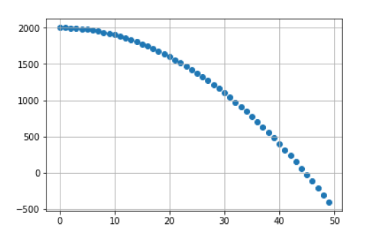
7.5 The matplotlib.pyplot.scatter() Function
The following program will generate a plot shown below it
import matplotlib.pyplot as plt
X = range(50)
y = [2000 – i ** 2 for i in X ]
plt.grid(True)
plt.scatter(X,y)
7.6 Labels and Titles
import matplotlib.pyplot as plt
plt.title(“Acceleration test”, size = ‘x-large’)
Note: size accepts any of these values: ‘xx-small’ | ‘x-small’
| ‘small’ | ‘medium’ | ‘large’ | ‘x-large’ | ‘xx-large’
plt.ylabel(‘Speed km/h’)
plt.xlabel(‘Seconds’)
7.7 Styles
In your visualizations, you can use any of the styles supported by the matplotlib.pyplot module to suit your aesthetic needs. The list of available styles can be obtained with this command:
#import matplotlib.pyplot as plt
plt.style.available
Notes:
The plt.style.available output:
[‘seaborn-whitegrid’,
‘_classic_test’,
‘dark_background’,
‘seaborn-deep’,
‘seaborn-white’,
‘fast’,
‘fivethirtyeight’,
‘ggplot’,
‘seaborn-colorblind’,
‘bmh’,
‘tableau-colorblind10’,
‘seaborn-ticks’,
‘seaborn-notebook’,
‘seaborn-darkgrid’,
‘seaborn’,
‘seaborn-pastel’,
‘grayscale’,
‘Solarize_Light2’,
‘seaborn-talk’,
‘seaborn-muted’,
‘seaborn-dark’,
‘seaborn-poster’,
‘classic’,
‘seaborn-dark-palette’,
‘seaborn-bright’,
‘seaborn-paper’]
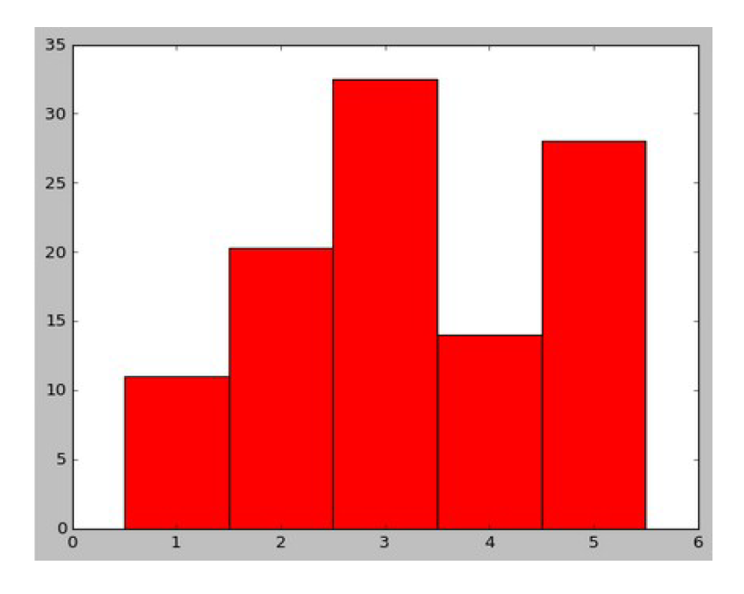
7.8 The matplotlib.pyplot.bar() Function
The following command will render a simple bar chart:
plt.bar( [1,2,3,4,5 ], [11.0,20.3,32.5,13.99,28.0 ], width =1, color = “r”)
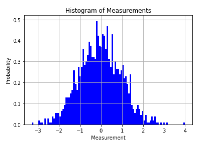
7.9 The matplotlib.pyplot.hist () Function
import matplotlib.pyplot as plt
import random as rnd
rnd.seed(111)
mean, std = 0, 1
X = [rnd.gauss(mean, std) for i in range(1500) ]
plt.hist(X, 100, density=True, facecolor=’b’)
plt.xlabel(‘Measurement’)
plt.ylabel(‘Probability’)
plt.title(‘Histogram of Measurements’)
plt.grid(True)
plt.show()
rnd.seed(111)
mean, std = 0, 1
X = [rnd.gauss(mean, std) for i in range(1500) ]
plt.hist(X, 100, density=True, facecolor=’b’)
plt.xlabel(‘Measurement’)
plt.ylabel(‘Probability’)
plt.title(‘Histogram of Measurements’)
plt.grid(True)
plt.show()
The generated histogram is shown below:
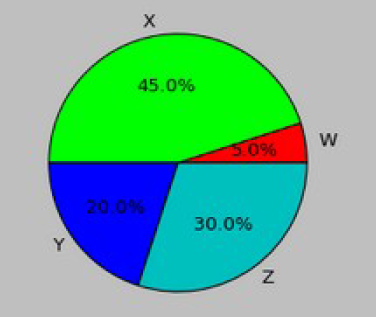
7.10 The matplotlib.pyplot.pie () Function
The following command will render a simple pie chart:
plt.pie( [5,45,20,30 ], autopct=’%1.1f%%’, colors= [”r”,”#00FF00″, “b”, “c” ], radius=0.6, labels= [’W’, ‘X’, ‘Y’,’Z’ ])
7.11 The Figure Object
The matplotlib.pyplot.figure() method creates a new shape that will hold your visualizations.
One of the more important parameters is figsize which takes two parameters: float width in inches, and float height in inches). If not provided, defaults to [6.4, 4.8 ]. You can create multiple figures before the final call to show(); the figures will be stacked when rendered; you can access them by using the figure index.
7.12 The matplotlib.pyplot.subplot() Function
The subplot() function creates a plotting grid on the fly and allows developers to select and set a grid cell in which subsequent plotting commands will work. The subplot() function configures the number of rows and columns in the grid using the 1-based notation.
A 2 x 3 grid will have this layout:
[1,1 ] [1,2 ] [1,3 ]
[2,1 ] [2,2 ] [2,3 ]
Subsequent subplot() calls should keep the shape of the grid
The subplot() function has this call signature:
subplot(nrows, ncols, index, **kwargs)
index is the position in the graphics rendering queue
When the show() method is called, the rendering sequence will be executed per subplot’s index (1, 2, 3, etc.)
7.13 Selecting a Grid Cell
If nrows, ncols and index are all less than 10 (the most common configuration), they all can be concatenated to make a single three-digit number that acts as a grid cell index, e.g. subplot(321) – will create (or re-use from the previous call) a 3×2 grid making that cell [3,2 ] the first available for drawing.
Note: When you start plotting directly, e.g. by invoking the plt.pie(), you work in a grid containing just one cell and matplotlib will implicitly create a subplot using the subplot(111) function call.
Notes:
A subplot() sequence call may look as follows (we have a 2×2 plotting grid):
plt.subplot(222)
plt.plot (… # graphics here will be rendered 2nd in sequence
plt.subplot(221)
plt.plot ( … # graphics here will be rendered 1st in order
plt.subplot(224)
plt.plot ( … # graphics here will be rendered 4th in order
…
plt.show()
7.14 Saving Figures to a File
Use the matplotlib.pyplot.savefig() function to save the generated figure to a file on the local file system. Matplotlib will try to figure out the file’s format using the file’s extension. Supported formats are, eps, jpeg, jpg, pdf, pgf, png, ps, raw, rgba, svg, svgz, tif, tiff. No, gif’s are not supported. Example:
plt.plot(range(20), ‘rx’)
plt.savefig(‘img/justARedLine.jpeg’, dpi=600)
The destination directory must exist. No show() call is needed. For more details, visit:
https://matplotlib.org/api/_as_gen/matplotlib.pyplot.savefig.html#matplotlib. pyplot.savefig
7.15 Summary
In this tutorial, we reviewed a number of data visualization features matplotlib Python graphics package:
◊ 2D plotting
◊ Creating bars
◊ Creating histograms
◊ Sub-plotting
◊ Saving figures