In this tutorial, we will explore basic form development.
Before you start working on this tutorial, please install the required software as mentioned in the Set Up Guide here.
Most common tasks with form development are:
-
Pre-populating form controls with data. For example, populate a text box and select an item in a list box.
-
Obtain user’s input.
-
Validate user’s input.
-
Post user’s input to the server.
Angular provides two different ways of doing this:
-
Template driven – The form is entirely defined in HTML template. This is very similar to the way we did things in AngularJS 1.x.
-
Model driven – Several aspects of the form are defined in component code. This makes your form unit testable.
This lab focuses on the template driven approach.
We will build a form that incorporates all the common HTML input controls.
Part 1 – Create a New Project
1.Create a folder ‘C:\LabWork’ on your machine.
2. Open a command prompt window.
3. Go to the C:\LabWork folder.
4. Run this command to create a new project called form-test.
ng new form-test –defaults
Part 2 – Add NgModel Directive Support
Data binding for the form input elements heavily depends on the NgModel directive. This is not available unless our application module imports the FormsModule. We will do that now.
1. Open form-test\src\app\app.module.ts.
2. Add this import statement.
import { FormsModule } from '@angular/forms';
3. Add the FormsModule to the imports list of the NgModule decorator. Now all directives from FormsModule will be available throughout our application.
  imports: [
    BrowserModule,
    FormsModule
  ],
4. Save changes.
Part 3 – Create the Component
1. From the C:\LabWork\form-test folder run this command.
ng generate component magazine
If you do not have Angular CLI installed globally then run:
npm run ng generate component magazine
Part 4 – Design the Model
It is generally a good idea to focus first on the data structure of the form first. The form design will be much easier after that.
1. Open form-test/src/app/magazine/magazine.component.ts.
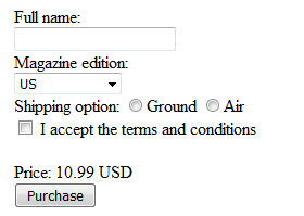
2. In the MagazineComponent class, add these fields that will act as the model for our form. Cross check the model with the screenshot of the form shown earlier.
export class MagazineComponent implements OnInit {
  fullName = ""
  editions = [
    {editionCode: 1, editionName: "US", price: "10.99 USD"},
    {editionCode: 2, editionName: "Canada", price: "14.99 CAD"},
    {editionCode: 3, editionName: "International", price: "23.99 USD"}
  ]
  selectedEdition = this.editions //Choose US by default
  selectedShipping = ""
  acceptPolicy = false
...
3. Save changes.
We will now start to design the form in the component’s template.
Part 5 – Add the Text Box
We will now add the text for the “Full name” field.
1. Open magazine.component.html. Delete the current contents.
2. Add the following HTML template to the component replacing the existing code.
Full name:<br/>
<input type="text" ="fullName"/><br/>
Basically, we are setting up a two-way data binding between the fullName field and the text box.
3. Save changes.
Part 6 – Add the Drop Down List
We will now add the dropdown (select element) for the magazine edition. Lists often show dynamic data. In this case, we need to show items from the “editions” field of the component.
1. In the HTML template, below the text box add the following.
Magazine edition:<br/>
<select ="selectedEdition">
  <option *ngFor="let e of editions"
    ="e">{{e.editionName}}</option>
</select><br/>
First look at the <option> tag. We are using the ngFor directive to loop through the “editions” collection. We are defining a local variable called “e” for each item in the collection. The value for each option is the corresponding edition object. This is set using ngValue.
The option tags will show the editionName property for the corresponding edition. This is done using the {{e.editionName}} expression.
Lastly, look at the <select> tag. It has a two-way binding with the selectedEdition field of the component class. When user selects an option the corresponding edition object will be assigned to the selectedEdition field.
2. Save changes.
Part 7 – Add the Shipping Radio Buttons
1. Below the </select> tag add:
Shipping option:
<input type="radio" name="selectedShipping"
    ="selectedShipping" value="GROUND"/>Ground
<input type="radio" name="selectedShipping"
    ="selectedShipping" value="AIR"/>Air
<br/>
The only thing worth noting here is that we use the name attribute for the radio button elements to group them together. This is standard HTML but just worth paying attention.
2. Save changes.
Part 8 – Add the Check Box
1. Below the radio buttons add:
<label><input type="checkbox" ="acceptPolicy"/>
  I accept the terms and conditions</label><br/>
We are setting up a two-way data binding between this checkbox and the acceptPolicy field which is of boolean type.
2. Save changes.
Part 9 – Display Price of the Selected Edition
We save the selected edition object in the selectedEdition field. This makes it trivial to show the price.
1. Below the checkbox add:
    <input type="checkbox" ="acceptPolicy"/>
        I accept the terms and conditions<br/>
    <br/>
    Price: {{selectedEdition.price}}
    <br/>
2. Save changes.
Part 10 – Add the Submit Button
1. Below the price display add:
Price: {{selectedEdition.price}} <br/><button (click)="submitForm()">Purchase</button>
2. Save changes.
Part 11 – Implement the Submission Logic
In real life, you will likely make an Ajax request to submit the form. Here we will simply display the JSON for the request.
1. In the Magazine class, add the submitForm() method like this.
export class MagazineComponent implements OnInit {
...
   submitForm() {
       let requestData = {
           customerName: this.fullName,
           productCode: this.selectedEdition.editionCode,
           acceptPolicy: this.acceptPolicy,
           shipMode: this.selectedShipping
       }
       alert(JSON.stringify(requestData))
   }
...
2. Save changes.
Part 12 – Use the Component
Now we will add the component to a page and try it out.
1. Open form-test/src/app/app.component.html.
2. Change the template like this.
<app-magazine></app-magazine>3. Save changes.
Part 13 – Test Changes
1. Open a command prompt and navigate to the root folder of the project:
C:\LabWork\form-test2. Run the following command to compile TypeScript and start the server:
npm start
3. Open a web browser to http://localhost:4200/
 4. Enter a name in the full name field.
5. Change the magazine edition. Verify that the price display changes correctly.
6. Select shipping.
7. Check the box to accept terms.
8. Click the Purchase button.
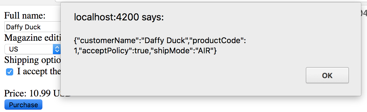 9. Verify that the JSON has the user input. If the browser has an option to prevent further dialogs, make sure to NOT select the option. Click OK.
10. In the command prompt, hit ‘<CTRL>-C‘ to terminate the batch job.
11. Close all open files.
Part 14 – Review
In this tutorial, we implemented a simple form using Angular. This was basically an exercise in data binding for different types of controls.