This tutorial is adapted from Web Age course Intermediate Data Engineering with Python.
Data visualization is a great vehicle for communicating data analysis results to potentially not technical stakeholders, as well as being a critical activity in exploratory data analysis (EDA). In this tutorial, you will learn about data visualization options available in Python.
For input, we will use a file hosted on GitHub that you can view in your browser by navigating to:
This file is an adapted version of the mtcars built-in dataset used in the R programming language. The mtcars dataset is Motor Trend Car Road Tests extracted from the 1974 Motor Trend US magazine and comprises a number of aspects of automobile design and performance for 32 automobiles (1973–74 models).
The mtcars dataset has been slightly modified to make it more suitable for our needs. It has the following attributes:
mpg	 Miles/(US) gallon
cyl	 Number of cylinders
disp	 Displacement (cu.in.)
hp	 Gross horsepower
wt	 Weight (1000 lbs)
qsec	 1/4 mile time  (~acceleration capability)
am	 Transmission (0 = automatic, 1 = manual)
gear	 Number of forward gears
carb	 Number of carburetors
Additionally, we added car names as the first column that will be used as an index of the pandas DataFrame we are going to build off of the dataset.
Part 1 – Create a New Notebook
1. Go to the Databricks Community Cloud (DCC) Welcome page and click New Notebook.
2. Create a new notebook with this configuration:
Name: Data Visualization and EDA
Language: Python
Cluster: C1
Note: If the C1 cluster has been terminated due to user inactivity, delete the old one and create a new cluster using the instructions contained in Lab 1 – Learning the Databricks Community Cloud Lab Environment. Make sure you do not miss the
spark.databricks.workspace.matplotlibInline.enabled = true
DCC Spark configuration.
When the notebook opens, make sure that the C1 cluster is shown as active (marked as a green circle) and attached.
Part 2 – Import the Required Modules
1. In the active code cell, enter the following commands:
import pandas as pd
%matplotlib inline
import matplotlib.pyplot as plt
import seaborn as sns
Note: The %matplotlib inline meta-command is used to instruct the rendering engine to embed generated graphics right in the notebook. It is an example of the so-called “magic” command borrowed from IPython. Without this “magic”, you will need to type plt.show() every time you need to render a plot.
The alias of seaborn as sns has a history, which you may safely ignore. Feel free to use whatever alias makes sense to you – we will stick with the traditional sns, though.
Part 3 – Download and Load the Input File
1. Download the input file from GitHub using the built-in wget command:
!wget http://bit.ly/36je2mw -O /dbfs/cars.csv
2. Verify that the file was successfully downloaded:
%fs ls
You should see the following output related to the downloaded file:
path			name 			size
dbfs:/cars.csv 	cars.csv		1501
3. Enter the following command to load the file into a new pandas DataFrame:
input_file = '/dbfs/cars.csv'
cars = pd.read_csv(input_file)
4. Check the index of the data frame with this command:
cars.index
5. Get the data set’s info with this command:
cars.info()
6. Find out the shape of the pandas DataFrame:
cars.shape
You should see the following output:
(32, 9)
Part 4 – Using the seaborn Graphics Package
The seaborn module [https://seaborn.pydata.org/] is built on top of the matplotlib library. Searborn enables developers to create attractive and informative graphics while delegating all the infrastructure graphics calls to matplotlib.
Note: Here is the link to the seaborn cheat sheet: https://s3.amazonaws.com/assets.datacamp.com/blog_assets/Python_Seaborn_Cheat_Sheet.pdf
1. Enter the following commands to load seaborn’s default theme and color palette for your session and then add the whitegrid style:
sns.set()
sns.set_style('whitegrid')
We are going to demonstrate a few seaborn graph types using the cars pandas DataFrame.
Part 5 – Histograms and KDE
We will start with plotting univariate distributions using the distplot() function which combines the regular histogram plot along with the fitted kernel density estimate (KDE). Note: You can get rid of the KDE curve by passing in the kde=False parameter.
1. Enter the following command:
sns.distplot (cars.hp)
You should see the following output:
 Note: You can get help on the distplot function using the help function:
help(sns.distplot)
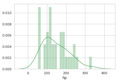
You can get a more detailed view of hp distribution by adding the bins parameter (we also changed the color of the histogram below – we are “going green” now):
sns.distplot (cars.hp, color='g', bins=20)
You should see the following graph rendered:
 You can also visualize bivariate distributions. These plots are rendered with jointplot():
2. Enter the following command:
sns.jointplot(x="hp", y="wt", data=cars, kind="kde")
You should see the following output:
 For more information on the distribution visualizations seaborn’s capability, visit: https://seaborn.pydata.org/tutorial/distributions.html#distribution-tutorial
Part 6 – Boxplots
Boxplots are also supported by seaborn and can be quite effective in identifying outliers in your data.
1. Enter the following command:
sns.boxplot(cars.qsec, orient='v', palette='summer')
You should see the following output:
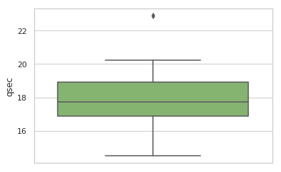 Here we can see that the qsec variable has an obvious outlier, which you can identify with this command:
cars
You should see the following output:
	    mpg	cyl	disp	hp	wt	qsec	am	gear	carb
Merc 230	22.8	4	140.8	95	3.15	22.9	0	4	2
Part 7 – Categorical Scatter plots
Categorical scatter plots are great visualization tools in EDA exercises. In seaborn, those are supported with the catplot() method.
1. Enter the following command:
sns.catplot(x='gear', y = 'mpg', data = cars)
You should see the following output:
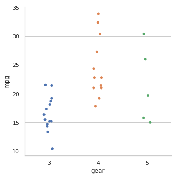 Gear is a categorical variable with three levels (3, 4, and 5) and catplot() separates the mpg variable scatter plots in three lanes accordingly. The plot also adds some “jitter” to avoid the coalescing of close data points. You can see the effects of data points clubbing each other with the jitter = False named parameter.
Note: Use the height and aspect configuration properties, e.g. height = 7, aspect = 1, to control the size and the shape of multiple (e.g. pairwise) plots produced by such functions, as catplot(), pairplot(), lmplot() and jointplot()).
When plotting with matplotlib directly, use matplotlib.pyplot.figure’s figsize configuration property, which you can also re-use in single-plot seaborn functions.
Now, let’s demonstrate a common technique that is sort of adding the “third dimension” to our 2D plots. Most graphics packages do this by using a color scheme where a specific color represents a level in a categorical variable. In our case, we can blend in the number of cylinders to our catplots.
2. Find out the unique numbers of cylinders in the mtcars DataFrame (the solution is at the end of this lab part).
You should have the following result: 4, 6, and 8.
Now we can plug in the number of cylinders as three distinct colors into our catplot.
3. Enter the following command:
sns.catplot(x='gear', y = 'mpg', data = cars, hue = 'cyl')
You should see the following output:
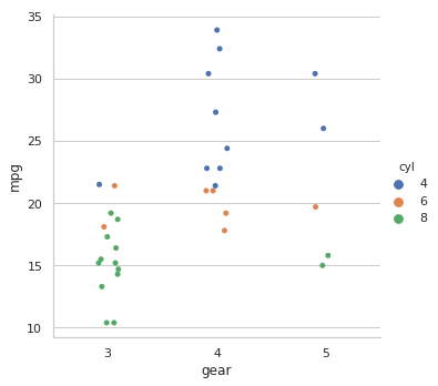 As you have already figured out, the color mapping is done with the hue named parameter pointing to the categorical variable cyl to represent the colors (in our case, the color scheme is provided automatically).
4. Enter the following command:
sns.catplot(x='gear', y = 'mpg', kind='box', data = cars)
You should see the following output:
 For more information on categorical variable visualization in seaborn, visit:
https://seaborn.pydata.org/tutorial/categorical.html#categorical-tutorial
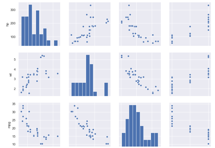
Part 8 – Pair Plots
Pair plots are indispensable in multivariate data analysis. Seaborn supports this type of EDA through the pairplot() function.
To make our visualization task outcomes easier to interpret, we will drop some of the variables.
1. Enter the following command:
columns =
df2 = cars .copy()
df2 will have this shape: (32, 6).
2. Enter the following command:
sns.pairplot(df2)
You should see the following output (only part of the pair plot is shown):
Can we get better than the above visualization? What if we set ourselves the task of enabling us to discern the effect of the number of cylinders the engines have on other variables? Can we apply the coloring scheme we did earlier? Will the hue=’cyl’ parameter setting work here as well?
You should see the following output (only part of it is shown below) when you apply the required changes:
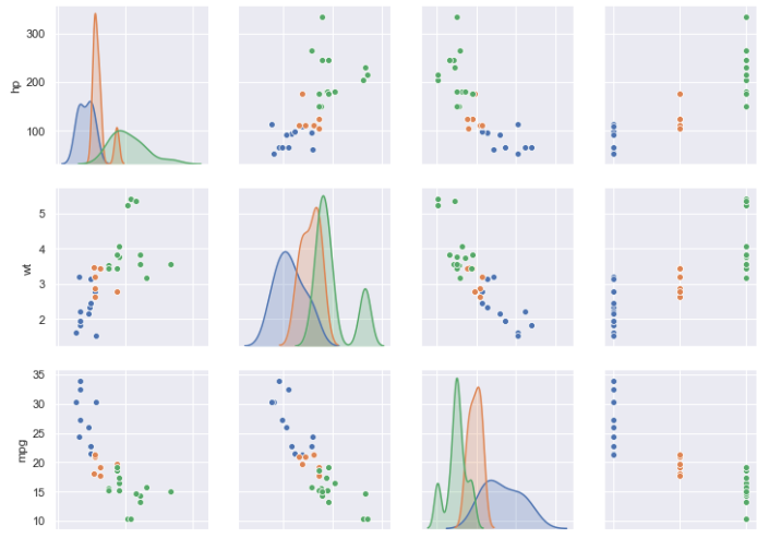 That’s much better, isn’t it? The color legends are shown on the right-hand side:
 Now the plots lend themselves for much more insightful interpretation. For example, you can immediately discern the effect of the number of cylinders in the wt-hp relationship (the first column and the second row in the chart):
 Sure enough, heavier vehicles require more powerful engines with more cylinders.
Part 9 – Heatmaps
As you might have noticed, there are some highly correlated variables the relationship of which we may want to visualize in a more quantifiable way. Heatmaps, popularized, among other tools, by Microsoft Excel, is one way of doing this. Seaborn offers the heatmap() function for that.
1. Enter the following command:
sns.heatmap(df2.corr())
You should see the following output:
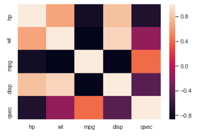 The darker and lighter cells represent the higher negative and positive correlation coefficients respectively.
Here is the pairwise correlation matrix that you can create with the df2.corr() command:
           hp	           wt	           mpg	          disp	          qsec
hp	1.000000	0.658748	-0.776168	0.790949	-0.708223
wt	0.658748	1.000000	-0.867659	0.887980	-0.174716
mpg	-0.776168	-0.867659	1.000000	-0.847551	0.418684
disp	0.790949	0.887980	-0.847551	1.000000	-0.433698
qsec	-0.708223	-0.174716	0.418684	-0.433698	1.000000
Find the most correlated pairs of variables, see if it is easier to locate those values using the above heatmap.
The color mapping is controlled by the cmap parameter, which you can set to any of the supported mapping, e.g. “YlGnBu“. How do you know then what are the valid parameter values without having to go to the seaborn website for help? Just plug in anything for the cmap value and seaborn will throw an exception printing the valid cmap values.
While there is much more to discuss, this is all the time we have for this lab.
Part 10 – Clean-Up
1. Expand the notebook’s attached cluster drop-down, and click Detach under C1.
2. Confirm the operation.
Keep the browser window open as we are going to use it later.
This is the last step in this lab.
Part 11 – Review
In this tutorial, you learned how to interface with the seaborn graphics package for rendering various plots in Jupyter notebooks. You also performed a number of useful EDA activities.