Home  > Resources  > Blog

Introduction to Angular Material

 
November 1, 2019 by Karandeep Kaur
Category: Angular

This tutorial is adapted from Web Age course Comprehensive Angular 8 Programming.

1.1  What is Material Design (MD)?

Material Design is design language developed by Google. It was released in 2014 and incorporated into the Android OS. It is also available for other platforms (Angular, Web, iOS, Flutter, …). Developers can achieve uniformity in their applications across platforms by using Material Design. It uses paper and Ink paradigm. It uses shadows and lighting to create depth and edges. It incorporates movement that reinforces choice and navigation.

Material Design Specification can be found at https://material.io/design/.

1.2  What is Angular Material (AM)?

Angular Material contains components that implement Material Design UI standards and can be used with Angular. Angular Material components are Built in and for Angular, Reactive – they work across web, mobile and desktop, Fully tested, tuned and optimized, Themeable and Accessible, Support internationalization (i18n) .Using Angular Material components speeds up development.

The main page for Angular Material can be found at https://material.angular.io/.

AM speeds up development by solving the issues listed above which allows teams to spend more time developing application-centric code as opposed to designing and creating basic components

1.3  How to Add Angular Material to a Project?

To use Angular Material it needs to be added to an existing Angular project

  • First Create an Angular Project:

    • Install NodeJS (download installer from NodeJS website)

    • Install Angular CLI: npm install -g @angular/cli@latest

    • Create Angular Project: ng new <app-name> –defaults

  • Next Install Angular Material into the Angular Project

    • Add AM to Project:: ng add @angular/material

    • Follow prompts to:

      • Choose Theme

      • Choose Y/N Setup for gesture recognition

      • Choose Y/N Setup for browser animations

For full setup instructions see the Angular Material – Getting Started page here:

https://material.angular.io/guide/getting-started

The –defaults flag on the ‘ng new’ command creates an Angular project without routing support and with plain CSS for styling. If desired you can set these differently by leaving off –defaults and following prompts or you can add parameters to the command as follows:

ng new <app-name> --routing true --style 

1.4  What is Angular Default Component?

The Angular project can be started as usual using:

ng serve (or npm start)

Once up and running the app displays the following default component (app.component.ts) which does not use Angular Material:

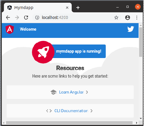
To start development replace the contents of app.component.html with your own template code.

1.5  What is Angular Material Schematics?

Angular Material’s ‘add’ schematic lets you add Angular Material to an Angular project:

ng add @angular/material

Schematics for creating components are also available:

address-form – Creates an address form component

navigation – Creates a component pre-set with sidenav and toolbar

dashboard – Creates a component with cards in a grid layout

table – Creates a table component with sorting and pagination

tree – Creates a tree structure component

Component schematics are used like this:

ng generate @angular/material:dashboard <comp-name>

Notes

Installing one of the above components will also import any Angular Material modules required by the component.

More information on Angular Material schematics is available here:

https://material.angular.io/guide/schematics

1.6 Angular Material Modules

Angular Material consists of various Modules :MatSidenavModule – Side Navigation, MatToolbarModule – ToolBar, MatIconModule – Icons, MatListModule – Lists, MatCardModule – Cards, MatButtonModule – Buttons, MatTableModule – Tables, MatDialogModule – Dialogs, MatInputModule – Form Input Fields, MatSelectModule – Dropdown Input Field. Each module must be imported separately before it’s features can be used

1.7  How to Add Angular Material Modules to a Project?

Modules must be added to your application before you can use them. The initial install of Angular Material into your project does not install any Angular Material modules. Modules can be added in one of two ways-Modules can be added directly to the app.module.ts file, An additional module can be created just to handle importing of the Angular Material modules (e.g. material.module.ts). Using a separate module reduces clutter in the app.module.ts file. The material.module.ts file is then included in the app.module.ts file as a single import and added to the imports array.

1.8 material.module.ts File

material.module.ts file example

This file goes in the same directory as the app.module.ts file

import {NgModule} from '@angular/core';
import { MatIconModule, MatCardModule } from '@angular/material';
@NgModule({
  imports: ,
  exports: 
})
export class MaterialModule {}

This example imports just a few modules. In practice you can expect to import a half dozen or more.

Notes

Keep in mind that when using one of the Angular Material component schematics it will add module imports directly to the app.module.ts file. In such a case you may want to move those imports out of the app.module.ts file and add them instead to your material.module.ts file.

1.9  How to Add material.module.ts to a Project?

material.module.ts is added to the app.module.ts file

import { BrowserModule } from '@angular/platform-browser';
import { NgModule } from '@angular/core';
import { AppComponent } from './app.component';
import { MaterialModule } from './material.module'
@NgModule({
  declarations: ,
  imports: [ BrowserModule, MaterialModule ],
  bootstrap: 
})
export class AppModule { }

1.10 Angular Material Themes

A theme is a set of colors that can be applied to Angular Material components.

  • Each Theme consist of the following palettes

Primary Palette – Most widely used colors

Accent Palette – Used for floating or interactive elements

Warm Palette – Used to denote errors

Foreground Palette – For text and icons

Background Palette – For backgrounds

1.11 How to Use Themes?

Built-in themes include DeepPurple-Amber, Indigo-Pink, Pink-BlueGrey, Purple-Green. Themes are included by adding a line like this to the styles.css file

@import '@angular/material/prebuilt-themes/deeppurple-amber.css';

Theme colors are mapped by default to some components (e.g. Toolbar). Not all components have themed colors (e.g. Card)

1.12  How to Configure Animations?

Animations include ripple effects when buttons are clicked and slide and fade in-out component transitions during navigation. Animations are enabled during the addition of Angular Material to a project when the BrowserAnimationsModule is imported and added to the imports array in the appmodule.ts file. Angular Material Animations will not run unless this module is imported.

import {BrowserAnimationsModule} 
from '@angular/platform-browser/animations';
...
@NgModule({
  declarations: ,
  imports: [ BrowserModule, 
             MaterialModule, 
             BrowserAnimationsModule ],
  bootstrap: 
})
export class AppModule { }

1.13 Enabling Gesture Support

Angular Material uses the HammerJS package to support gestures. HammerJS will be installed for you if you choose Yes when asked when the angular/material schematic runs.

If you chose No you can still install it later by:

  • Installing the package

npm install --save hammerjs
    • Adding an import for it at the top of main.ts

import 'hammerjs';

Gestures supported by this package include: Pan, Pinch, Press, Rotate, Swipe and Tap.

Components that make use of gestures include: mat-slide-toggle, mat-slider, matTooltip,…

1.14 Angular Material Icons

Material Design includes open source sets of icons that can be used in applications.

Icons are displayed using the mat-icon component:

<mat-icon 
  aria-hidden="false" 
  aria-label="Example home icon"
>home</mat-icon>

The above HTML displays the ‘home’ icon.

 Many other icons exist including, alarm, bookmark, delete, done, event, face, list, print, today. Several categories of Icons are available, Action, Alert, Av, Communication, Content, Device, Editor, File, Hardware, Image, Maps, Navigation, Places, Social, Toggle.

Available icons can be found here:

https://material.io/resources/icons/?style=baseline

1.15 Angular Material Components

  • Angular Material includes the following categories of components:

    • Navigation – Containers for navigation elements

    • Layout – Containers for presenting content

    • Form Controls – Form input controls

    • Buttons & Indicators – Buttons, toggles, status &, progress indicators

    • Popups & Modals – Floating components that can be hidden or shown

    • Data Table – Table and related components

  • See here for more information about components:

https://material.angular.io/components/categories

1.16 Navigation

Angular Material provides three containers for navigational items

Menu – A floating panel of items

Sidenav – A container that slides out from the side of the screen

Toolbar – A container for title information and screen controls

  • Menu Example

<button mat-button =”menu”>Menu</button>

<mat-menu #menu=”matMenu”>

<button mat-menu-item>Item 1</button>

<button mat-menu-item>Item 2</button>

</mat-menu>

Notes

More information on navigational components can be found here:

https://material.angular.io/components/categories/nav

1.17 Layout

Angular Material supports several layout related components

List – Displays list of items

Tree – Displays hierarchical content

Card – Container for itemized content

Tabs – Displays one view out of multiple possible views

Expansion Panel – Container that can be expanded

GridList – Flexible grid based container for items

Stepper – Wizard type interface

Divider – Vertical or horizontal divider

Notes

For more information on Angular Material layouts see:

https://material.angular.io/components/categories/layout

1.18 Layout Examples

  • Basic Card

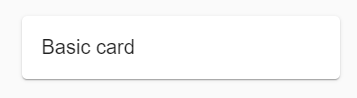
  <mat-card>Basic card</mat-card> 

  • List

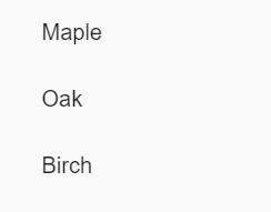
<mat-list role="list">
  <mat-list-item role="listitem">Maple</mat-list-item>
  <mat-list-item role="listitem">Oak</mat-list-item>
  <mat-list-item role="listitem">Birch</mat-list-item>
</mat-list>

Notes

The official documentation includes examples of all layout types:

https://material.angular.io/components/categories/layout

For more information on cards see:
https://material.angular.io/components/card/overview

For more information on Lists see:

https://material.angular.io/components/list/overview

1.19 Form Components

Angular Material includes support for the following form input controls

Autocomplete – User types and it suggests selections

Checkbox – For boolean input

Datepicker – A directive for use with <input> fields

Input – A directive for use with <input> elements

Radio button – Supports mutually exclusive selections

Select – Drop down selector

Slider – Selects value from a range

Slide Toggle – On/Off toggle

Controls exist as either an Angular Material component (e.g. mat-slider) or as a directive used with the standard HTML input element

Notes

More information on form components can be found here:

https://material.angular.io/components/categories/forms

1.20 Example Controls

  • A Select Field

<mat-form-field>
  <mat-label>Favorite Car</mat-label>
  <mat-select>
    <mat-option *ngFor="let car of cars"
    ="car.value">
      {{car.viewValue}}
    </mat-option>
  </mat-select>
</mat-form-field>
  • Basic Input Field

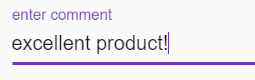
<mat-form-field class="example-full-width">
  <input matInput placeholder="enter comment">
</mat-form-field>

Notes

For more on Angular Material form input fields see:

https://material.angular.io/components/categories/forms

1.21 Summary

  • In this tutorial, we covered:

    • Material Design

    • Angular Material

    • Adding Angular Material to a Project

    • Angular Material Schematics

    • Angular Material Modules

    • Adding Modules to a Project

    • Themes

    • Configuring Animations

    • Enabling Gesture Support

    • Icons

    • Components

Follow Us

Blog Categories