This tutorial is adapted from Web Age course Advanced Data Analytics with Pyspark.
1.1 Data Visualization
The common wisdom states that ‘Seeing is believing and a picture is worth a thousand words’. Data visualization techniques help users understand the data, underlying trends and patterns by displaying it in a variety of graphical forms (heat maps, scatter plots, charts, etc.) . Data visualization is also a great vehicle for communicating analysis results to stakeholders. Data visualization is an indispensable activity in exploratory data analysis (EDA). Business intelligence software vendors usually bundle data visualization tools into their products. There are a number of free tools that may offer similar capabilities in certain areas of data visualization.
1.2 Data Visualization in Python
The three most popular data visualization libraries with Python developers
are:
- matplotlib,
- seaborn, and
- ggplot
seaborn is built on top of matplotlib and you need to perform the required matplotlib imports.
1.3 Matplotlib
Matplotlib [https://matplotlib.org/] is a Python graphics library for data visualization. The project dates back to 2002 and offers Python developers a MATLAB-like plotting interface. It depends on NumPy. You can generate plots, histograms, power spectra, bar charts, error charts, scatter plots, etc., with just a few lines of code. Matplotlib’s main focus is 2D plotting; 3D plotting is possible with the mplot3d package. It is a 2D and 3D desktop plotting package for Python. 3D plots are supported through the mtplot3d toolkit. It supports different graphics platforms and toolkits, as well as all the common vector and raster graphics formats (JPG, PNG, GIF, SVG, PDF, etc.). Matplotlib can be used in Python scripts, IPython REPL, and Jupyter notebooks.
1.4 Getting Started with matplotlib
In your Python program, you start by importing the matplotlib.pyplot module and aliasing it like so:
import matplotlib.pyplot as plt
In Jupyter notebooks, you can instruct the graphics rendering engine to embed the generated graphs with the notebook page with this “magic” command:
%matplotlib inline
The generated graphics will be in-lined in your notebook and there will be no plotting window popping up as in stand-alone Python (including IPython). You can now use the matplotlib.pyplot object to draw your plots using its graphics functions. When done, invoke plt.show() command to render your plot. The show() function discards the object when you close the plot window (you cannot run plt.show() again on the same object). In Jupyter notebook you are not required to use the show() method, also, in order to suppress some diagnostic messages, simply add ‘;’ at the end of the last graph rendering command.
1.5 Figures
The matplotlib.pyplot.figure() method call will launch the plotting window and render the image there. You can create multiple figures before the final call to show(), upon which all the images will be rendered in their respective plotting windows. You can optionally pass the function a number or a string as a parameter representing the figure coordinates to help moving back and forth between the figures. An important function parameter is figsize which holds a tuple of the figure width and height in inches, e.g. plt.figure(figsize=). The default figsize values are 6.4 and 4.8 inches.
Examples of using the figure() function in stand-alone Python
plt.figure(1) # Subsequent graphics commands will be rendered in the first plotting window
plt.subplot(211) # You can set the figure’s grid layout
plt.plot( …
plt.subplot(212)
plt.plot( …
plt.figure(2) # Now all the subsequent graphics will be
# rendered in a second window
plt.plot( …
plt.figure(1) # You can go back to figure #1
…
plt.show() # Two stacked-up plotting windows will be generated
Note: You can drop the figure() parameters in case you do not plan to alternate between the figures.
1.6 Saving Figures to a File
Use the matplotlib.pyplot.savefig() function to save the generated figure to a file. Matplotlib will try to figure out the file’s format using the file’s extension. Supported formats are eps, jpeg, jpg, pdf, pgf, png, ps, raw, rgba, svg, svgz, tif, tiff.
gif is not supported.
Example:
plt.plot(range(20), ‘rx’)
plt.savefig(‘img/justRedLineToX.jpeg’, dpi=600)
The destination directory must exist. No show() call is needed. For more details, visit: https://matplotlib.org/api/_as_gen/matplotlib.pyplot.savefig.html#matplotlib.pyplot.savefig
1.7 Seaborn
seaborn is a popular data visualization and EDA library [https://seaborn.pydata.org/]. It is based on matplotlib and is closely integrated with pandas data structures. It has a number of attractive features. It has a dataset-oriented API for examining relationships between multiple variables. It has a convenient views of complex datasets. It has high-level abstractions for structuring multi-plot grids and it has concise control over matplotlib figure styling with several built-in themes.
1.8 Getting Started with seaborn
The required imports are as follows:
%matplotlib inline
import matplotlib.pyplot as plt
import seaborn as sns
Optionally, you can start your data visualization session by resetting the rendering engine settings to seaborn’s default theme and color palette using this command:
sns.set()
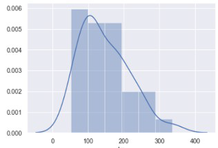
1.9 Histograms and KDE
You can render histogram plots along with the fitted kernel density estimate (KDE) line with the distplot() function, e.g.
sns.distplot (pandas_df.column_name)
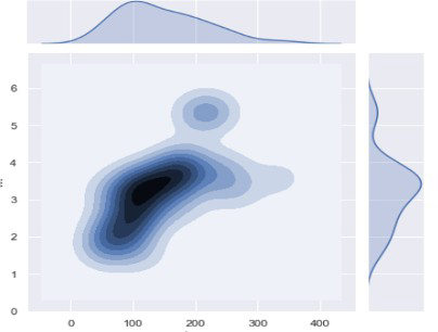
1.10 Plotting Bivariate Distributions
In addition to plotting univariate distributions (using the distplot() function), seaborn offers a way to plot bivariate distributions using the joinplot() function:
sns.jointplot(x=”col_nameA”, y=”col_nameB”, data=DF, kind=”kde”);
1.11 Scatter plots in seaborn
Scatter plots are rendered using the scatterplot() function, for example:
sns.scatterplot(x, y, hue=);

1.12 Pair plots in seaborn
The pairplot() function automatically plots pairwise relationships between variables in a dataset. A sample output of the function is shown below.
Note: Trying to plot too many variables (stored as columns in you DataFrame) in one go may clutter the resulting pair plot.

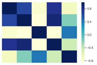
1.13 Heatmaps
Heatmaps, popularized by Microsoft Excel, are supported in seaborn through its heatmap() function.
A sample output of the function is shown below.
1.14 Summary
In this tutorial, we reviewed two main data visualization packages in Python:
- matplotlib
- seaborn