This tutorial is adapted from the Web Age course https://www.webagesolutions.com/courses/WA3057-data-science-and-data-engineering-for-architects.
1.1 Why Do I Need Data Visualization?
- The common wisdom states that:
- Seeing is believing and a picture is worth a thousand words
- Data visualization techniques help users understand the data, underlying trends and patterns by displaying it in a variety of graphical forms (heat maps, scatter plots, charts, etc.)
- Data visualization is also a great vehicle for communicating analysis results to stakeholders
- Data visualization is an indispensable activity in exploratory data analysis (EDA)
- Business intelligence software vendors usually bundle data visualization tools into their products
- There are a number of free tools that may offer similar capabilities in certain areas of data visualization
1.2 Data Visualization in Python
- The two most popular data visualization libraries with Python developers are:
- matplotlib, and
- seaborn
Notes:
Visualization with pandas
The pandas module leverages the matplotlib module for creating an easy-to-use visualization API (https://pandas.pydata.org/pandas-docs/stable/visualization.html) against the target DataFrame – you just need to import the matplotlib.pyplot module first.
Matplotlib
- Matplotlib [https://matplotlib.org/] is a Python graphics library for data visualization.
- The project dates back to 2002 and offers Python developers a MATLAB-like plotting interface.
- Depends on NumPy.
- You can generate plots, histograms, power spectra, bar charts, error charts, scatter plots, etc., with just a few lines of code.
- Matplotlib’s main focus is 2D plotting; 3D plotting is possible with the mplot3d package.
- The 2D and 3D desktop plotting package for Python.
- 3D plots are supported through the mtplot3d toolkit.
- It supports different graphics platforms and toolkits, as well as all the common vector and raster graphics formats (JPG, PNG, GIF, SVG, PDF, etc.)
- Matplotlib can be used in Python scripts, IPython REPL, and Jupyter notebooks.
1.3 Getting Started with matplotlib
- In your Python program or Jupyter notebook, you start by importing the matplotlib.pyplot module and aliasing it like so:
import matplotlib.pyplot as plt
- In Jupyter notebooks, you can instruct the graphics rendering engine to embed the generated graphs with the notebook page with this “magic” command:
%matplotlib inline
- The generated graphics will be in-lined in your notebook and there will be no plotting window popping up as in stand-alone Python (including IPython)
- You can now use the matplotlib.pyplot object to draw your plots using its graphics functions
- Note: Any methods mentioned in the text below are those of the matplotlib.pyplot object
- When done, invoke the show() method (of the matplotlib.pyplot object) to render your plot
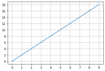
1.4A Basic Plot
| %matplotlib inline import matplotlib.pyplot as plt x = [i for i in range(10)] y = [x[i] * 2 for i in x] plt.grid() plt.plot(x,y) plt.xticks(x) plt.yticks(y) plt.show() |
Notes:
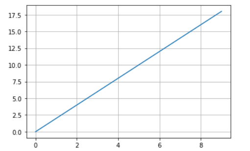
Without the xticks() and yticks() methods, the plot will use some calculated values for the x and y coordinates that may not be quite user-friendly:
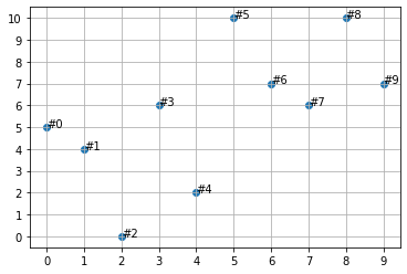
1.5 Scatter Plots
| import random random.seed(1011) dots_count = 10 x = [i for i in range(dots_count)] y = [random.randint(0,dots_count) for i in x] plt.grid() plt.scatter(x,y) plt.xticks(range(dots_count)) plt.yticks(range(dots_count + 1)) for i in range(dots_count): plt.annotate(“#” + str(i), (x[i], y[i])) plt.show() |
Notes:
Here is the unwrapped code from the slide:
import random
random.seed(1011)
dots_count = 10
x = [i for i in range(dots_count)]
y = [random.randint(0,dots_count) for i in x]
plt.grid()
plt.scatter(x,y)
plt.xticks(range(dots_count))
plt.yticks(range(dots_count + 1))
for i in range(dots_count):
    plt.annotate("#" + str(i), (x[i], y[i]))
plt.show()
The y list holds the following random numbers:
[5, 4, 0, 6, 2, 10, 7, 6, 10, 7]
The plt.annotate() method annotates a single data point on the plot.
1.6 Figures
- The figure() method call will launch the plotting window and render the image there
- You can create multiple figures before the final call to show(), upon which all the images will be rendered in their respective plotting windows
- You can optionally pass the function a number or a string as a parameter representing the figure coordinates to help the moving back and forth between the figures
- An important function parameter is figsize which holds a tuple of the figure width and height in inches, e.g. plt.figure(figsize=[12,8])
- the default figsize values are 6.4 and 4.8 inches
1.7 Saving Figures to a File
- Use the savefig() method to save the generated figure to a file
- Matplotlib will try to figure out the file’s format using the file’s extension
- Supported formats are:
- eps, jpeg, jpg, pdf, pgf, png, ps, raw, rgba, svg, svgz, tif, tiff
- No, gif is not supported
- eps, jpeg, jpg, pdf, pgf, png, ps, raw, rgba, svg, svgz, tif, tiff
- Example:
    # Build a plot ...
    # Then save it to a local file ...
    plt.savefig('img/justRedLineToX.jpeg', dpi=600)
- Note: The destination directory must exist
- For more details, visit https://matplotlib.org/api/_as_gen/matplotlib.pyplot.savefig.html#matplotlib.pyplot.savefig
1.8 Seaborn
- The seaborn data visualization package [https://seaborn.pydata.org/] is based and operates on top of matplotlib; it is tightly integrated with pandas data structures
- It has a number of attractive features, including:
- A dataset-oriented API for examining relationships between multiple variables
- Convenient views of complex datasets
- High-level abstractions for structuring multi-plot grids
- Concise control over matplotlib figure styling with several built-in themes
1.9 Getting Started with seaborn
- The required imports are as follows:
%matplotlib inline
import matplotlib.pyplot as plt
import seaborn as sns
- Optionally, you can start your data visualization session by resetting the rendering engine settings to seaborn’s default theme and color palette using this command:
sns.set()
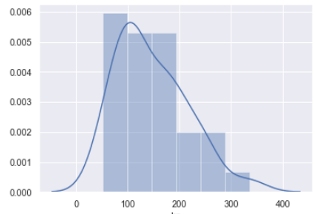
1.10 Histograms and KDE
- You can render histogram plots along with the fitted kernel density estimate (KDE) line with the distplot() function, e.g.
sns.distplot (pandas_df.column_name)
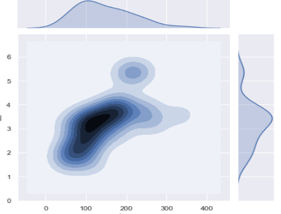
1.11 Plotting Bivariate Distributions
- In addition to plotting univariate distributions (using the distplot() function), seaborn offers a way to plot bivariate distributions using the joinplot() function:
sns.jointplot(x="col_nameA", y="col_nameB", data=DF, kind="kde");
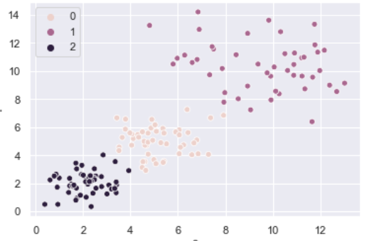
1.12 Scatter Plots in seaborn
- Scatter plots are rendered using the scatterplot() function, for example:
sns.scatterplot(x, y, hue=[list of color levels]);
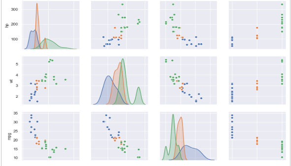
1.13 Pair plots in seaborn
- The pairplot() function automatically plots pairwise relationships between variables in a dataset
- A sample output of the function is shown below
- Note: Trying to plot too many variables (stored as columns in your DataFrame) in one go may clutter the resulting pair plot
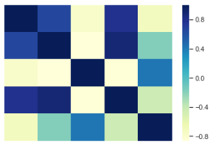
1.14 Heatmaps
- Heatmaps, popularized by Microsoft Excel, are supported in seaborn through its heatmap() function
- A sample output of the function is shown below
1.15A Seaborn Scatterplot with Varying Point Sizes and Hues
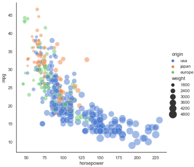
Notes:
The plot on the slide is borrowed from seaborn’s documentation: https://seaborn.pydata.org/examples/scatter_bubbles.html?highlight=hue
The relevant code is shown below; note that seaborn uses a pandas DataFrame to help with data rendering aspects organization (the mpg object is a DataFrame; values for hue, size, and other named parameters are taken from mpg’s columns referenced by their column index names):
import seaborn as sns
sns.set_theme(style="white")
# Load the example mpg dataset
mpg = sns.load_dataset("mpg")
# Plot miles per gallon against horsepower with other semantics
sns.relplot(x="horsepower", y="mpg", hue="origin", size="weight",
            sizes=(40, 400), alpha=.5, palette="muted",
            height=6, data=mpg)
1.16 Summary
- In this tutorial, we reviewed some of the graphing capabilities of the two main data visualization packages in Python:
- matplotlib
- seaborn